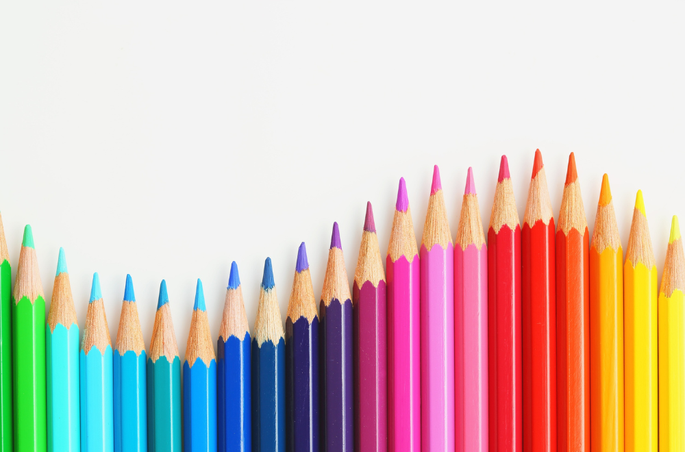
Walk into any supermarket, scroll through social media, or drive past a billboard, and you’ll notice one thing immediately: color is never accidental. Brands spend millions studying how colors influence perception, emotions, and buying behavior because color is often the first thing consumers notice before reading a headline or understanding a message.
In advertising, color is not just decoration. It is strategy.
From fast-food chains using red and yellow to stimulate appetite, to luxury brands relying on black to communicate sophistication, color psychology has become one of the most powerful tools in modern marketing. The right color can influence trust, urgency, excitement, confidence, or even purchasing decisions within seconds.
In a world where consumers are exposed to thousands of ads daily, understanding the psychology of color can determine whether a campaign gets ignored or remembered.
What Is Color Psychology in Advertising?
Color psychology refers to the study of how colors affect human emotions, perceptions, and behavior. In advertising and branding, it involves using specific colors intentionally to evoke certain feelings or actions from audiences.
Research consistently shows that visual appearance plays a major role in consumer decisions, and color significantly contributes to brand recognition and emotional recall. Consumers often make subconscious judgments about products within moments of seeing them, and color is one of the strongest influencing factors.
This is why brands carefully build entire identities around color palettes.
Think about some of the world’s most recognizable brands:
- Red is often associated with excitement, energy, and urgency.
- Blue communicates trust, reliability, and professionalism.
- Green represents health, nature, and sustainability.
- Black signals luxury, exclusivity, and authority.
- Yellow creates feelings of optimism and attention.
These associations are deeply embedded into advertising strategies across industries.
Why Color Matters in Advertising
Advertising works in seconds. Before audiences read copy, process information, or understand messaging, they react emotionally to visuals.
Color helps advertisers:
- Capture attention quickly
- Create emotional connections
- Increase brand recognition
- Influence purchasing behavior
- Establish brand positioning
- Improve message retention
Studies in marketing psychology suggest that color can improve brand recognition significantly when used consistently. This is why some brands become instantly identifiable from color alone.
Think about how recognizable certain shades have become:
- Tiffany Blue
- Coca-Cola Red
- McDonald’s Yellow
- Starbucks Green
These colors are not random aesthetic choices. They are carefully engineered branding assets.
The Meaning Behind Popular Advertising Colors
Red: Energy, Passion, and Urgency
Red is one of the most psychologically powerful colors in advertising. It stimulates excitement, passion, appetite, and urgency.
Brands use red when they want immediate attention or emotional intensity.
Common industries using red:
- Fast food
- Retail sales
- Entertainment
- Sports
- Automotive
Red is also widely used for clearance sales and call-to-action buttons because it creates urgency and encourages faster decision-making.
However, overusing red can sometimes feel aggressive or overwhelming, which is why balance matters.
Blue: Trust, Stability, and Reliability
Blue is among the most widely used colors in corporate branding because it creates a sense of trust and dependability.
Financial institutions, technology companies, healthcare providers, and corporate businesses frequently use blue because consumers associate it with professionalism and security.
Blue works particularly well for:
- Banks
- Insurance companies
- Technology brands
- Healthcare advertising
- Corporate branding
Unlike red, blue has a calming effect, making it effective for building long-term trust and credibility.
This is one reason why many social media platforms and global corporations incorporate blue into their logos and advertising.
Yellow: Optimism and Attention
Yellow naturally attracts attention because it is associated with brightness, positivity, and warmth.
Advertisers use yellow to create:
- Optimism
- Cheerfulness
- Friendliness
- Youthful energy
Yellow is often used strategically alongside red because the combination stimulates both excitement and visibility.
However, excessive yellow can create visual fatigue if not balanced correctly.
In outdoor advertising especially, yellow is effective because it remains highly visible from long distances, making it ideal for billboards and large-format campaigns.
Green: Health, Sustainability, and Growth
Green is strongly linked to nature, wellness, freshness, and sustainability.
As consumers become increasingly environmentally conscious, green has become a dominant color in:
- Organic products
- Eco-friendly campaigns
- Wellness brands
- Financial growth messaging
- Agricultural industries
Green also communicates balance and calmness, making it useful for brands wanting to appear ethical, natural, or health-focused.
But modern advertisers are becoming more careful about “greenwashing,” where brands appear environmentally friendly through visuals without authentic sustainable practices behind them.
Today’s consumers are highly aware of authenticity.
Black: Luxury, Power, and Sophistication
Black is commonly associated with exclusivity, elegance, authority, and premium quality.
Luxury brands frequently use minimalist black-and-white branding because it creates a timeless, high-end aesthetic.
Industries that commonly use black:
- Luxury fashion
- Automotive
- Technology
- Premium beauty products
- High-end services
Black creates contrast effectively and can make products appear more premium when paired with minimalist design.
However, depending on context, black can also feel intimidating or overly serious, so it is often balanced with metallics, white space, or softer tones.
White: Simplicity and Minimalism
White represents simplicity, cleanliness, and clarity.
Modern advertising increasingly uses white space to reduce visual clutter and create premium-looking campaigns.
White works particularly well in:
- Technology branding
- Healthcare advertising
- Minimalist design
- Luxury product photography
In digital advertising, white space improves readability and helps audiences focus on key messaging.
Minimalism itself has become a psychological branding tool.
Cultural Differences in Color Psychology
One of the biggest mistakes advertisers make is assuming color meanings are universal.
Color perception changes across cultures.
For example:
- White symbolizes purity in some cultures but mourning in others.
- Red represents luck and prosperity in many Asian cultures but danger or warning elsewhere.
- Green can symbolize growth in some regions while carrying political or religious associations in others.
Global brands must adapt color strategies depending on regional audiences.
This is particularly important in international advertising campaigns where a color choice that works in one market may create negative associations in another.
Successful advertisers combine universal psychology with cultural awareness.
Color Psychology in Digital Advertising
As digital platforms dominate consumer attention, color psychology has become even more critical online.
In digital advertising, colors influence:
- Click-through rates
- User engagement
- Conversion rates
- Website behavior
- Mobile app interaction
Call-to-action buttons are heavily tested using color psychology principles.
For example:
- Red buttons may increase urgency.
- Green buttons may suggest approval or progress.
- Orange buttons often create enthusiasm and action.
But there is no universally “best” color.
The effectiveness depends on:
- Brand identity
- Audience demographics
- Platform design
- Contrast
- User intent
Modern advertising agencies increasingly rely on A/B testing and behavioral analytics rather than assumptions alone.
The Role of Color in Outdoor Advertising
Color psychology becomes even more important in outdoor advertising because audiences often view ads from moving vehicles or long distances.
Outdoor advertising must communicate instantly.
High-contrast colors improve visibility and recall, while poor color choices can reduce readability entirely.
For billboards and large LED displays:
- Bright contrasts improve attention.
- Minimal color palettes improve clarity.
- Strategic lighting enhances emotional impact.
- Color saturation affects nighttime visibility.
This is why successful outdoor advertising campaigns simplify visual communication while maximizing emotional response.
In high-traffic environments, color can determine whether an ad is noticed at all.
Emotional Branding Through Color
Modern consumers rarely buy products based on functionality alone. They buy emotions, identity, and experiences.
Color helps create emotional branding.
A wellness brand using earthy greens and beige tones communicates calmness and balance. A sports brand using black and red creates intensity and performance. A luxury jewelry campaign using black and gold signals exclusivity and prestige.
The emotional tone begins before audiences read a single word.
Strong brands build consistent emotional experiences through repeated color usage across:
- Logos
- Packaging
- Websites
- Social media
- Retail stores
- Advertising campaigns
Consistency strengthens memory.
The Future of Color Psychology in Advertising
As consumer behavior evolves, color psychology is becoming more data-driven.
Brands are now combining:
- Behavioral analytics
- Neuromarketing
- Eye-tracking technology
- AI-powered design testing
- Audience segmentation
Advertisers are no longer relying only on traditional theories. They are testing emotional reactions in real time.
At the same time, trends continue to shift:
- Minimalist palettes are becoming more common.
- Sustainability-driven colors are increasing.
- Bold digital gradients are rising in tech branding.
- Accessibility and readability are becoming essential design priorities.
Color strategy today is both psychological and technological.
Color psychology is one of the most underestimated yet influential elements in advertising. While audiences may not consciously analyze color choices, they react emotionally to them almost instantly.
The right color can:
- Build trust
- Increase engagement
- Create urgency
- Strengthen recall
- Influence purchasing behavior
- Define brand identity
But effective color psychology is not about blindly following trends or assigning one emotion to one color. Context, audience, culture, industry, and design execution all matter.
The most successful advertising campaigns use color strategically, intentionally, and consistently to shape perception and create memorable brand experiences.
At Outreach Advertising, we specialize in this intersection of psychology and creative strategy. As an agency led by decades of advertising expertise, we don’t just choose colors that look good; we select the hues that drive ROI, build brand equity, and resonate with your specific target demographic. From high-impact OOH campaigns to digital storytelling, Outreach Advertising ensures your brand’s visual voice is loud, clear, and psychologically irresistible.
Related Posts
- Outreach
- October 15, 2025
Mastering AI Ad Copy: How to Write Prompts That Convert
The rise of generative AI has fundamentally changed the starting line for marketers. We can now ..

- Outreach
- July 10, 2024
Why Brands Must Hop on TikTok Marketing
Brands have one dream, okay two. To be known and for their products to be bought. Given the com ..
