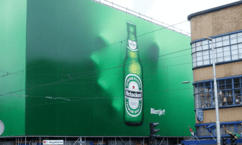
In the digital-first era, marketers often fall into the trap of thinking that “good design is universal.” However, a design that stops scrolling thumbs on Instagram will likely become invisible wallpaper on a highway billboard. Why? Because the viewing environment is fundamentally different. Designing for Out-of-Home (OOH) and massive Digital Out-of-Home (DOOH) screens isn’t about scaling up a web banner; it’s about engineering visual impact for an audience that is moving at 100 km/h, highly distracted, and viewing your message from hundreds of metres away.
When your canvas is a 14-metre wide “Mega Screen” and your audience has roughly three seconds to register your message, the rules of engagement change drastically. To succeed, you must move beyond aesthetics and into the realm of visual physics.
- Typography: The “Glance Value” Test
On the web, we discuss readability in terms of paragraphs and user experience. In OOH, readability is measured in milliseconds. If a viewer cannot decode the text instantly from 200 metres, the campaign has failed before it has even begun. This is what industry experts call “Glance Value.”
The Sans-Serif Mandate
Ornate scripts, thin serifs, and condensed fonts are the natural enemies of distance. At 200 metres, fine lines physically disappear due to atmospheric haze, and letterforms bleed together.
- Weight Matters: Stick to robust, heavyweight fonts. Medium to Bold weights is the “sweet spot.”
- The Choice of Typeface: Fonts like Helvetica Neue Black, Futura Bold, or Inter are industry standards for a reason—they maintain their structural integrity when viewed at an angle or under harsh lighting.
- Avoid the “Thin” Trap: Ultra-light or “hairline” fonts, while trendy in luxury web design, will literally vanish on a digital billboard during a sunny day.
Kerning and Tracking: The Space Between
Tight kerning (the space between individual letters) might look sleek on a high-resolution laptop, but it creates an illegible “ink blot” on a mega screen. Outdoor typography requires looser tracking. By adding slightly more space between letters, you ensure that the characters remain distinct and identifiable even when the viewer’s eyes are vibrating due to vehicle movement.
Real-World Example: Look at Apple’s OOH campaigns. They are the masters of the “three-word rule.” The product image is massive, and the text—usually just “iPhone” or “Shot on iPhone”—is bold, high-contrast, and instantly recognizable. They don’t make you work for the information; they deliver it with a visual sledgehammer.
Colour and Contrast: The “Squint Test”
Subtlety is a luxury you cannot afford outdoors. Between the glare of the sun, the grey of the asphalt, and the visual clutter of the urban landscape, your design is fighting a war for attention.
The Science of High Contrast
The “carrying power” of a design is determined by its contrast ratio. The highest carrying power comes from extreme pairings that do not exist naturally in high frequencies:
- Black on Yellow (The highest visibility combination used globally for traffic signs).
- Black on White.
- Yellow on Black.
- White on Blue.
The Squint Test Methodology
A professional OOH designer’s best tool is the “Squint Test.” Shrink your design on your monitor to 10% size and squint your eyes. If the headline and the brand logo blur into a single muddy shape, your contrast is insufficient. The elements must remain distinct even when your vision is “impaired.”
Beware of “Vibrating” Colours
“Vibration” occurs when you pair colours of similar saturation and value, such as bright red text on a bright blue background. While it looks “loud” on a screen, the edges of the letters will appear to shake or blur to the human eye, making it incredibly painful and difficult to read at a distance.
Real-World Example: Consider DHL’s branding. The vibrant yellow background with bold red text is perhaps one of the most aggressive, high-contrast combinations in existence. It is impossible to ignore in a grey urban environment, cutting through visual noise effectively and ensuring brand recall from extreme distances.
- Visual Hierarchy: The Three-Second Rule
You do not have time for a complicated narrative or a “discovery” phase in your design. OOH design requires ruthless prioritization. In a three-second window, a viewer will only absorb one, perhaps two, key elements.
The “Single Focal Point” Strategy
Your design needs one “Hero.” If you try to make the headline big, the product big, the discount code big, and the logo big—then nothing is big.
- The Hero: Usually, the product or a provocative 3 – 5 word headline.
- The Anchor: The brand logo, placed in a consistent, easy-to-find location (usually the bottom right or top right).
- The Directive: A single, simple Call to Action (CTA). In highway OOH, this is often a directional cue rather than a URL.
Element | Priority | Goal |
Visual/Image | 1st | Emotional hook and instant recognition |
Headline | 2nd | Context and “The Why” (Max 7 words) |
Branding | 3rd | Attribution (Who is talking?) |
Real-World Example: McDonald’s directional billboards are masterclasses in hierarchy. The Golden Arches are often the largest element because the brand is the message. The second largest element is the instruction (“Next Exit”). The food imagery is often secondary or omitted entirely. They understand the goal isn’t to sell a burger in that specific second, but to direct a hungry driver who already knows what a Big Mac is.
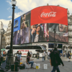
- Motion on Mega Screens: The Art of Subtlety
Digital Out-of-Home (DOOH) offers the power of motion, but treating a roadside mega screen like a TV commercial or a YouTube pre-roll is a fundamental mistake.
Passive vs. Active Motion
Full-motion video with fast cuts can be dangerously distracting to drivers and is often restricted by local transport authorities. More importantly, fast cuts are lost on an audience that is itself in motion.
- Subtle, Looping Motion: The most effective DOOH uses “cinemagraph” style motion. This involves keeping 90% of the image static while one element moves. Think of a slow, steaming rise from a coffee cup, a gentle glint of light across a watch face, or a slow parallax effect on a background layer.
- Peripheral Impact: Motion is designed to catch the viewer’s peripheral vision and “pull” their eyes toward the screen. Once you have their eyes, the static elements (the headline and logo) do the heavy lifting.
The Math of Scale: Understanding Pixel Pitch
When designing for Mega Screens, you must consider the hardware. Unlike a retina display on a phone, massive LED screens have a “pixel pitch” (the distance between each LED bulb).
If your design uses fine lines or tiny details, they may fall “between” the pixels, causing a jagged, low-quality look known as aliasing. Designing for distance means using bold shapes and clean lines that translate well across LED hardware, ensuring the image looks crisp whether the viewer is 50 metres or 500 metres away.
How Outreach Advertising Maximizes High-Impact Visuals
At Outreach Advertising, we understand that the translation from a creative concept to a 20-metre mega screen is where campaigns live or die. We don’t just “post” your files; we consult on the technical realities of large-format displays. Our team of experts ensures your colour profiles are calibrated for high-nit LED output, your typography passes the 200-metre distance test, and your motion graphics comply with local safety regulations while maximizing stopping power. We bridge the gap between creative intent and real-world physics, ensuring your brand doesn’t just appear on a screen—it dominates the landscape.
Related Posts
- Outreach
- November 23, 2021
How to make the best of your OOH advertising
How to make the best of your OOH advertising We now live in a marketing era where consumer ..
